The world's go-to partner for digital commerce everywhere
To imagine, engineer and inspire a universal future for commerce in which the entire world can realize its potential
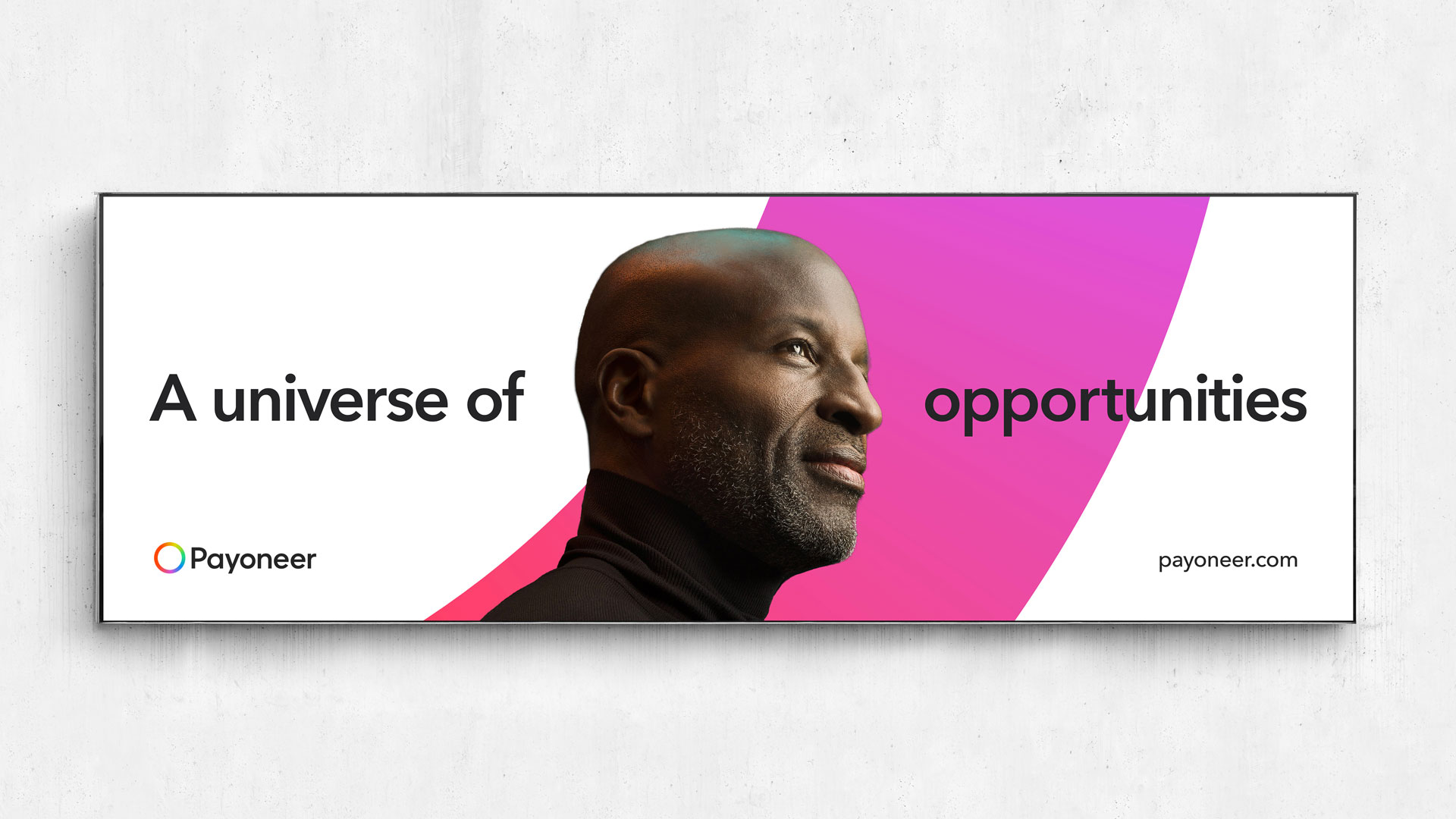
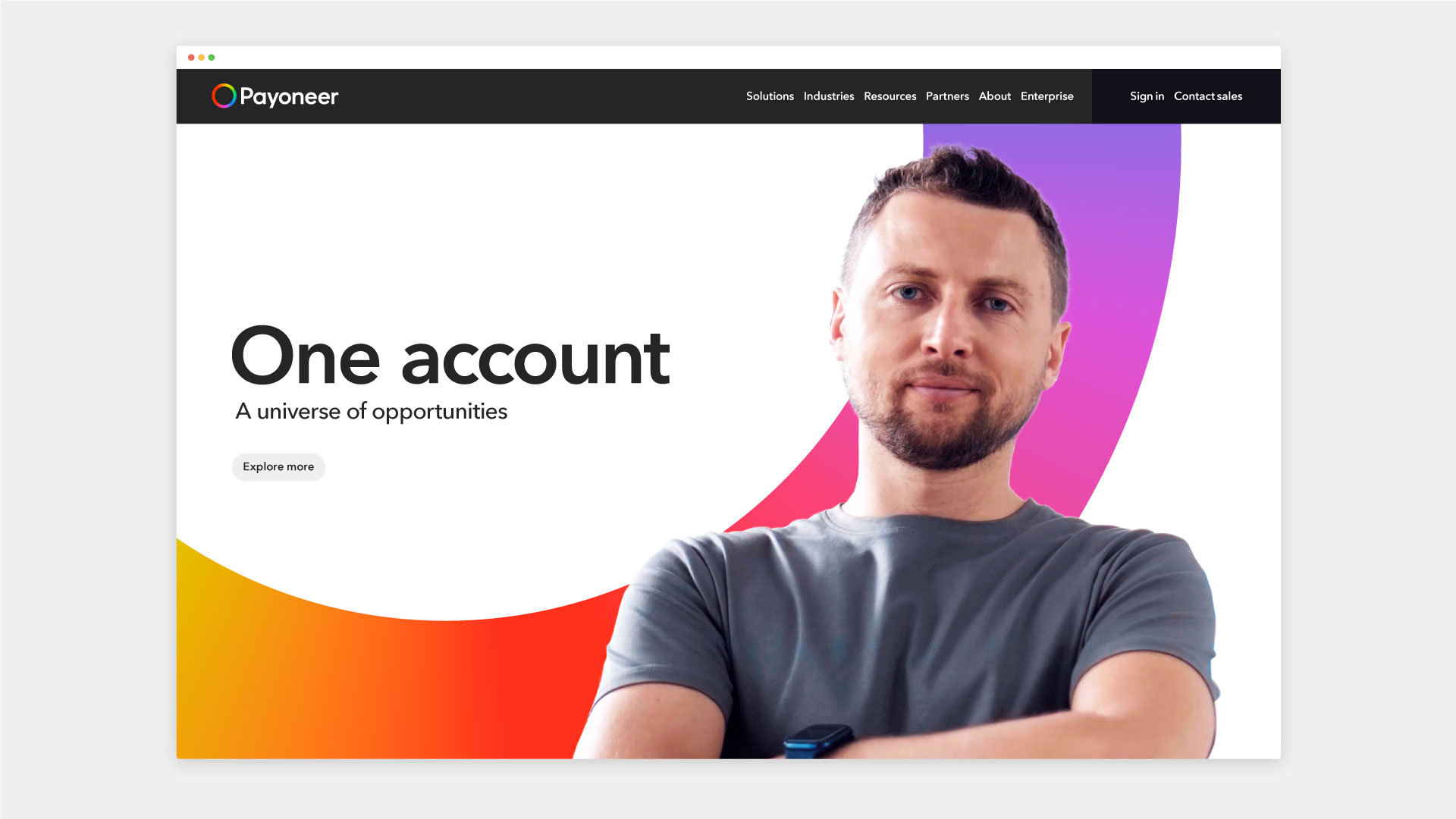
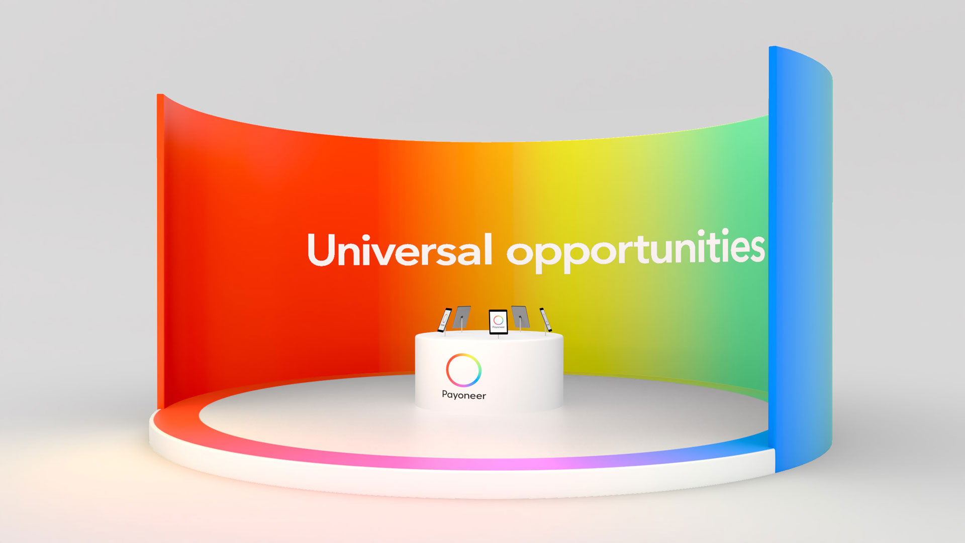
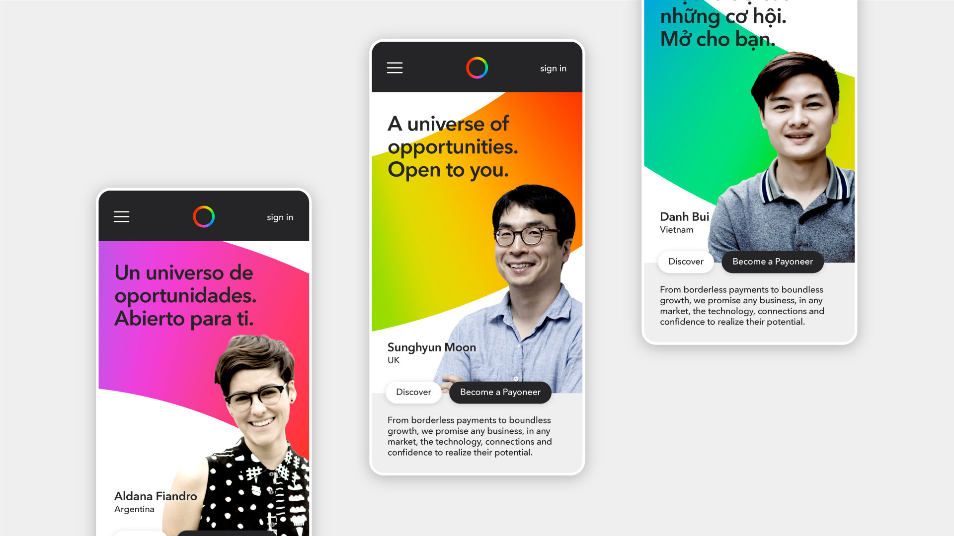
A universe of opportunities. The confidence, connections and tools to participate and flourish in the new global economy
Payoneer was born on the cusp of a new digital era; now we’re at the heart of it. An era defined by connectivity and openness. Where anyone, anywhere, is empowered to participate and succeed as a global citizen of a single digital economy.
Yet infinite opportunities create exponential complexity. This borderless world of open commerce brings new systems, unfamiliar rules and untold risks. These unknowns create fear and doubt that erode the confidence fueling the entrepreneurial spirit at the centre of everything.
For 15 years, Payoneer has pioneered this new reality. Serving markets others will not. Solving problems others cannot. Innovating tools others have not. Pushing frontiers, making connections, unifying and creating global ecosystems.
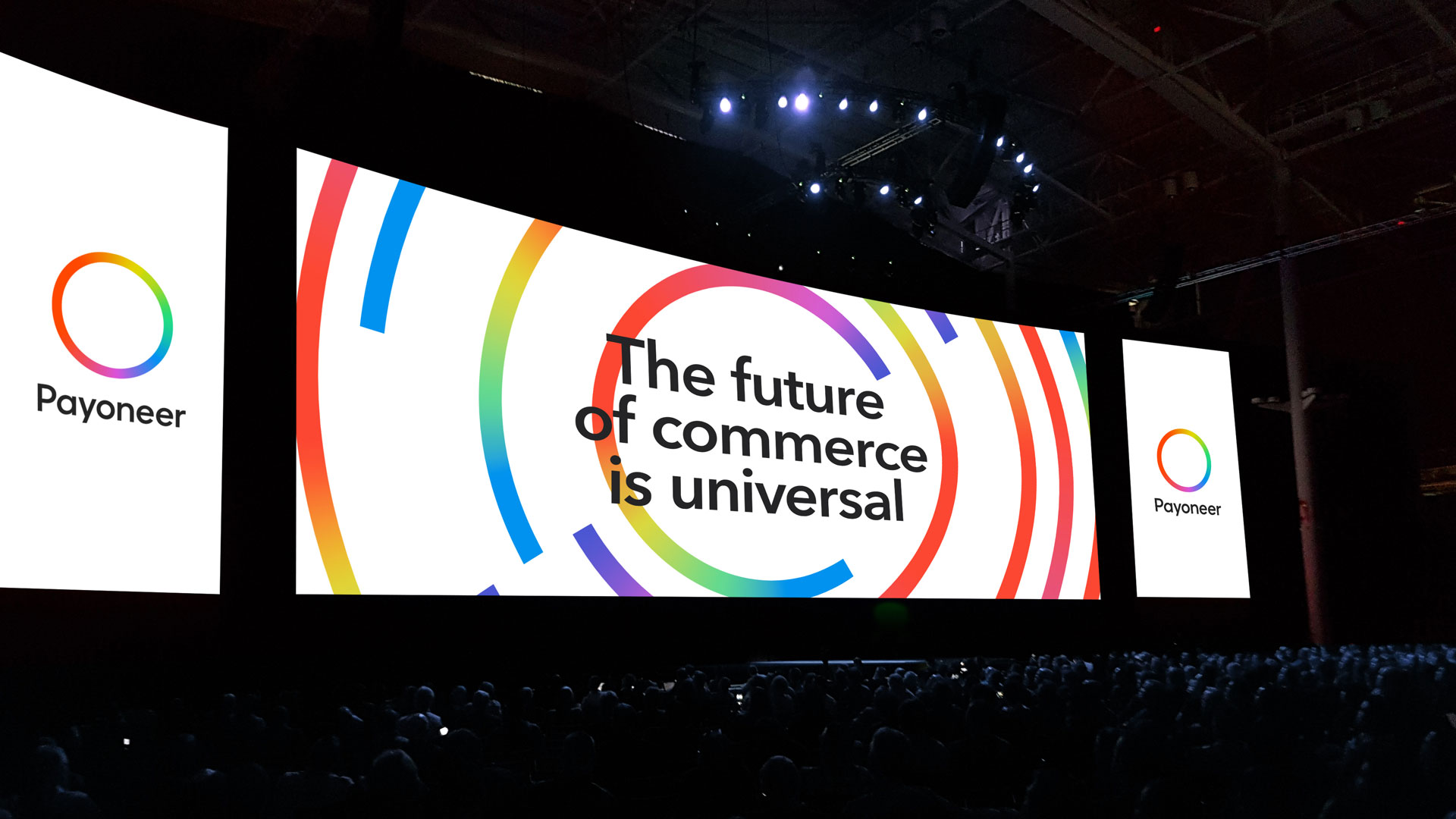
Every day, Payoneers imagine, engineer and inspire a universal future for commerce, so the entire world can realize its potential.
To express our new brand we have a new visual identity. The following assets and guides will help us all bring our new brand to life.
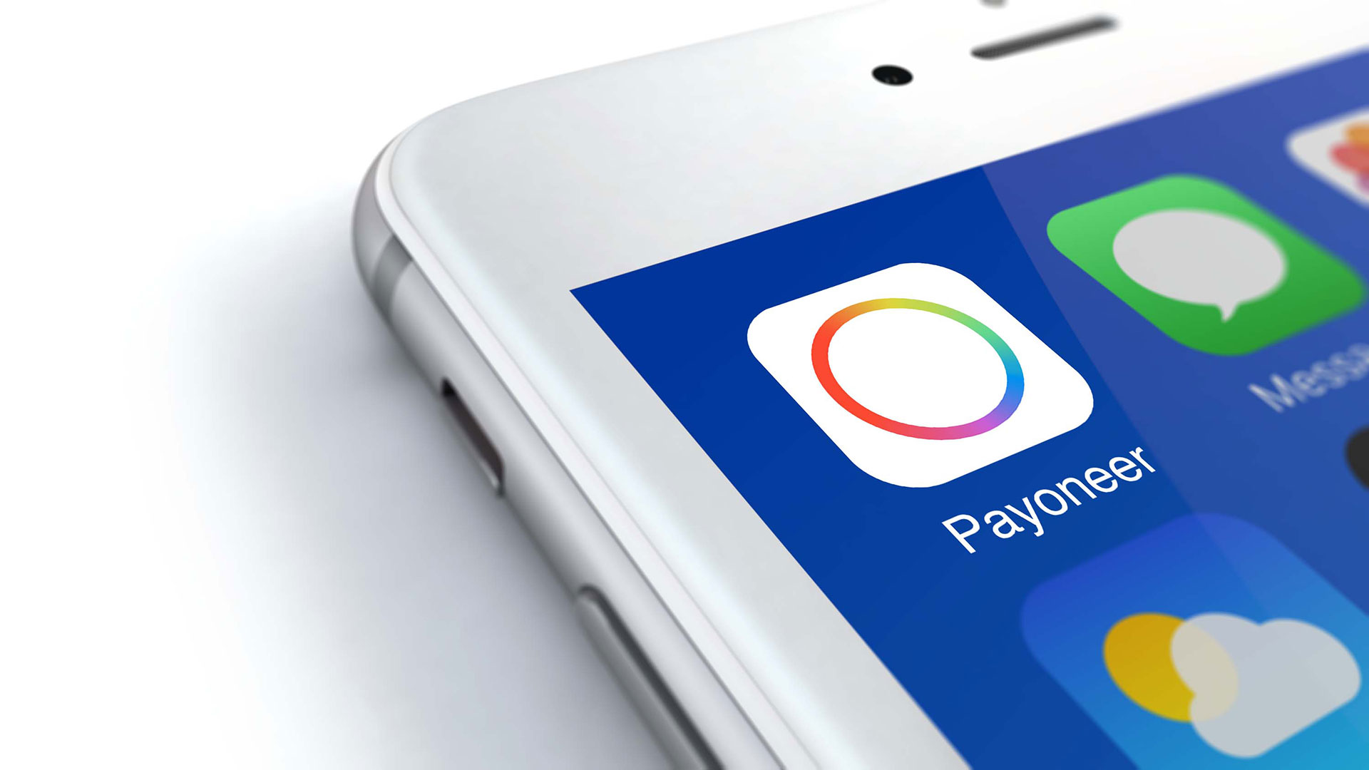
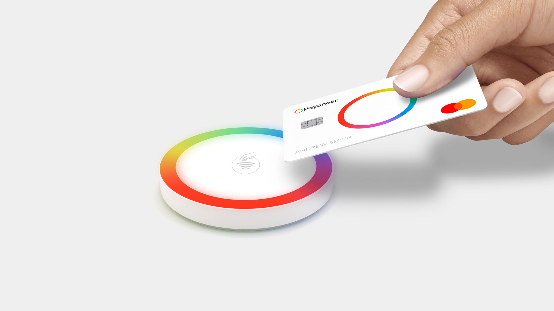
Our new logo, the Halo, is beautifully simple. It is a shorthand to connect our visual expression with our brand strategy. The Halo is a universal symbol. The single shape means being available anywhere. Every color means being inclusive and for anyone. Over time, our brand will help us be recognized and understood universally by all our customers. Below shows the different versions of the logo for print and screen. And you can download the full set of assets.

Color fills our brand with meaning. Using every color means we can stand for everyone and every opportunity, as well as demonstrating the diversity of our offer.
Our 5 colors work individually as solid colors, and together as gradients. We also have a selection of neutral colors.
Hover the swatches below to view color values, and click to copy.
Color is always held within the Halo. This may be cropped into to create colorful backgrounds. Where possible, color should be animated. Where static, the gradient can be manipulated so more colors are on show. We recommend having two to three colors visible. It's important not to mix up the order of the colors.
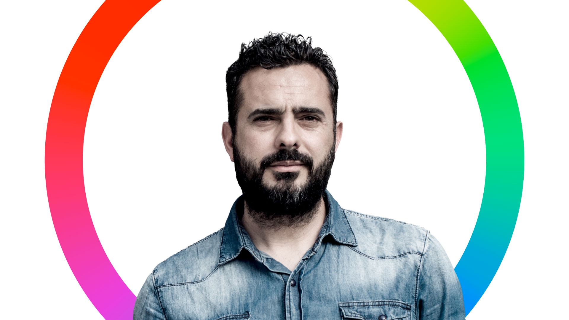
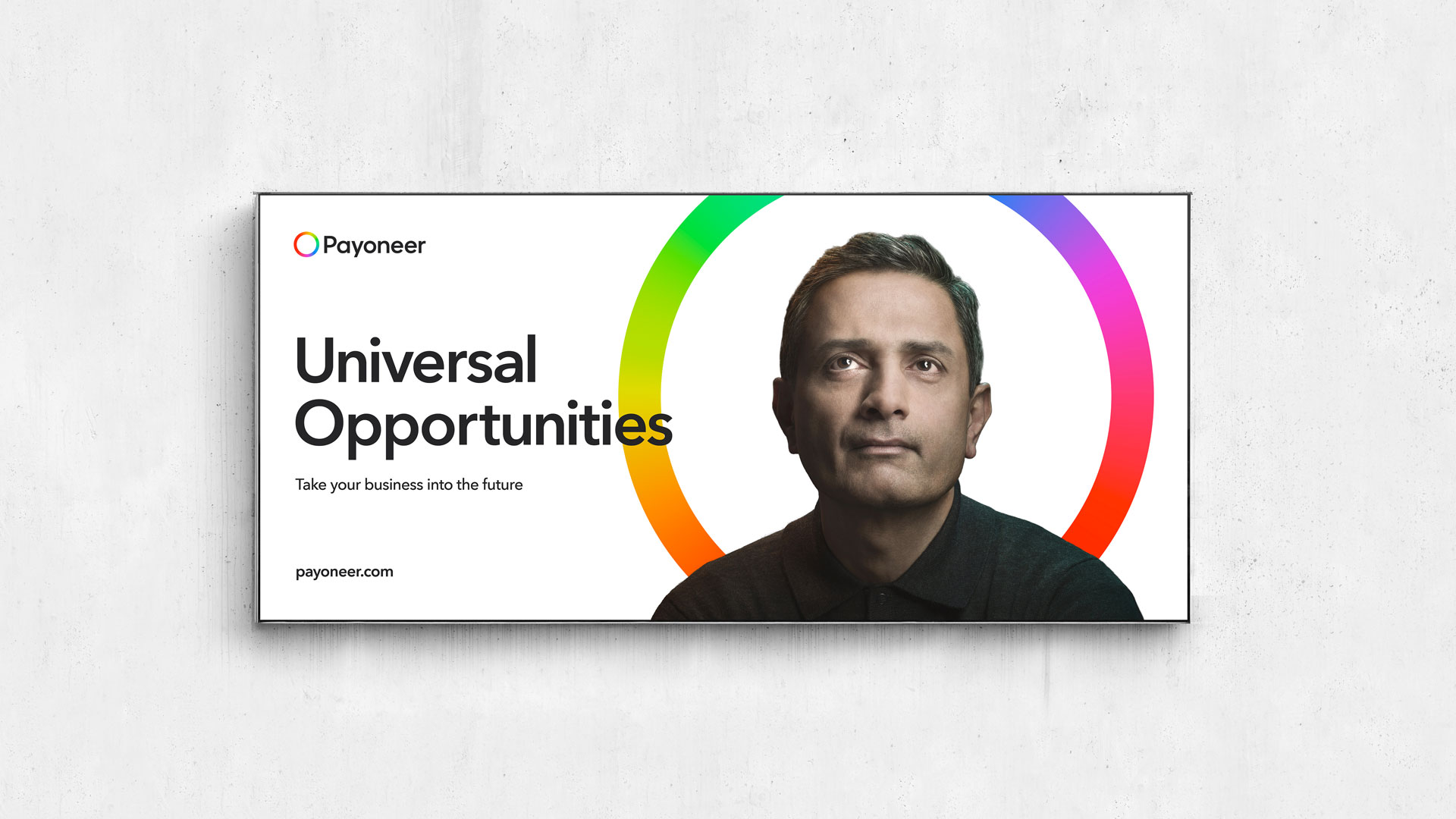
Our imagery demonstrates our inclusivity and helps add humanity to our brand. We use a distinctive but simple style, meaning anyone, anywhere can create imagery for our brand. Our photography can be used on light or dark backgrounds, and can be combined with crops of our symbol. Images can be downloaded below.

Our iconography means we can be universally understood. The visual style is derived from our Halo, and uses rounded strokes as well as our brand colours, in the level 2 icons.
Our typography is universal, and we aim to use one typeface, Avenir Next World, consistently across the entire brand, and across the world. We use Demi Bold for titles and Regular for body copy. We use sentence case throughout the brand. There are more weights and a condensed variation available for limited use. Buy Avenir Next World here.
Where our primary typeface cannot be used, such as for Japanese and Chinese languages, use our secondary typeface, Noto Sans, which can be downloaded for free here.
When all of these elements are combined, we have a brand that is truly Universal, wherever it might show up in the world. Use the gallery below as insipiration and best-use examples for when your are next designing for the Payoneer brand.
When using the Word template, download and install Avenir Next LT Pro from the font pull down lists in Office 365 for Windows and Mac (Look for the little ‘cloud plus arrow’ icon). In Powerpoint, it is not necessary to install as it is embedded in the template.


 Payoneer
Payoneer
Payoneer
Payoneer
Payoneer
Payoneer
Payoneer
Payoneer
Payoneer
Payoneer
Payoneer